
 By
By 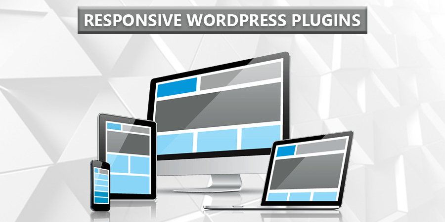
According to Statista.com – Mobile internet statistics and facts, active global mobile internet population worldwide as of August 2017 is 3.5 billion (almost half of the world’s population). Out of the whole internet traffic of the world, Mobile internet traffic beats desktop/laptops hands down standing at 52.64%.
Ever thought about how many of your readers or subscribers are accessing your website/blog using their mobile devices? Ever since the advent of smartphones, the mobile internet is on the exponential curve.
But have you experienced some sites are very much focused on their appearance optimized for the desktop/laptop audience but their sites fail to impress or are haphazardly optimized for the mobile phones? If more than half of the internet using population is getting a haphazardly optimized version of your website, you are losing more than half of your targeted audience and indirectly more than half of your earnings too!
Why do you need a Responsive Plugin?
So many bloggers fail to understand the exponential growth of the mobile internet user population. Little did they know that optimizing their website for the mobile users was just a plugin away. Is the solution so simple to such a huge problem? It may sound a bit exaggerating, but it’s true! The plugins help you customize how your website/blog looks to mobile users, how fast does your website /blog loads on a mobile device etc.
With the ever-increasing changes in algorithm and Google updates, it’s always better to be on top of the new Google rules. These are few of the main reasons all the top brands and fortune 500 companies made a beeline to get their website mobile optimized to ride the mobile user wave. HuffingtonPost got a good 1/3rd mobile viewership boost after it made changes to its website to be easy to use across all platforms. We have only listed out the best for you:
1. Jetpack
Jetpack is a plugin with over 33 specific features to boost your mobile responsive site but not just limited to that. It does much more than that. If you are well-versed with CSS and bit of PHP coding, you can customize your theme as you wish. It is ideal for anyone looking for creating zero cost mobile-friendly website.
Features of Jetpack include:
- Detailed information about your website traffic.
- Design your website with its Professional themes, tools for images and Customisation options.
- Protection from Brute Force attacks
- Automatic scanning and fixes for Malware
- Traffic Tools: Automatic promotion through Social Media, Options to edit META tags,
- Optimisation of website’s SEO, Excellent Mobile experience and so on.
- Fast user-interface
- Integration with WordPress apps for Desktop/Android/iOS.
Get Jetpack today!
2. WPTouch Mobile Plugin
With over half a million active sites running this plugin, it speaks for itself. It is also showcased on Google’s shortlist for top WP mobile solutions. With its “Infinity Cache”, it makes your website blazing fast using mobile caching. It also offers a pro (paid) version of this plugin with added features and themes bundled with the pro version.
Features of WPTouch include:
- Powerful settings for Mobile content
- Allows customisation of Title and Landing pages for Mobile visitors
- Seamless integration and easy SEO to make your website optimised and Google mobile friendly
- Low memory server footprint
- Supports multisite installations
- Includes Pro, Business, Developer and Enterprise solutions packed with different extra features.
Get WPTouch today!
3. Favicon by Real favicon Generator
Favicon – A Website icon, is not only aesthetically important but they also serve as a sort of bookmark for your website. You can create different favicon icon for iPhones, iPads, Android, Windows tablets or even a laptop/desktop.
A Website icon as shown above definitely grabs visitors’ attention. Make your website look catchy with Realfavicon Generator!
4. Dynamic Widgets
To make your website more Mobile friendly, Dynamic Widget gives you options to choose which pages to display or hide your widgets on. You can choose to show or hide those widgets by filtering a number of parameters like type of browser, IP Address, URL and even mobile devices.
But have a look at the main features:
- Default display setting supported for Dates, Browsers, Featured images, Devices, URL, Theme templates and so on.
- A number of exception rules can be created such as Device on type, Day of the week, User roles on role, IP on ranges and so on.
Get Dynamic Widgets today!
5. PageSpeed Insights
Make sure to check if your web pages are super fast and mobile responsive using this tool. As it is a tool created by Google, there is little to no doubt it will truly point out any shortcomings in your web pages, be it loading time or robots.txt etc.
This tool by Google provides a comprehensive list of solutions to any blogger with features such as:
- Detailed page reporting
- Exclusive feature of Report summaries with option to filter
- Desktop and Mobile Page reports for a better understanding of your website.
- Report snapshot of a summarised Historical data.
- Snapshot Comparison Tool to help you compare 2 report snapshots.
- Scheduled report checks of your website.
- Sizing the content to Viewport
Get PageSpeed Insights today!
Liked this article? Don’t forget to share it with your friends!


Comments